bwt <- MASS::birthwt$bwt
hist(bwt, freq = FALSE, breaks = 25)
m1 <- mean(bwt)
s1 <- sd(bwt)
curve(dnorm(x,m1,s1), add = TRUE, col = "red", lwd = 3)
box()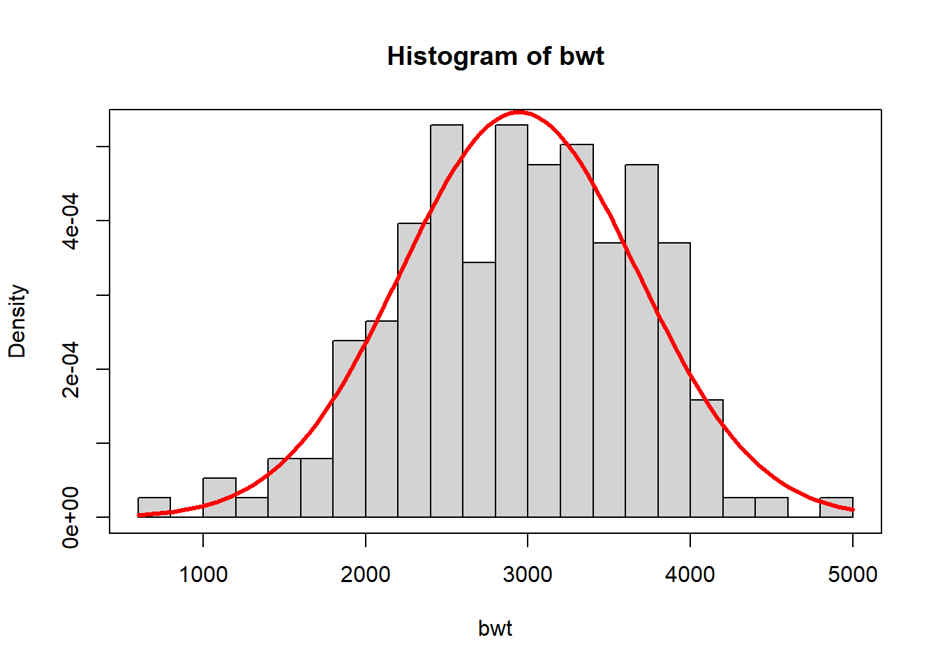
So far in part three, we have described how one might estimate a probability model from data, using one of several options. For example, you have seen how one might estimate the infant birth weight distribution using the normal distribution and maximum likelihood or the gamma distribution with method of moments or with kernel density estimation.
bwt <- MASS::birthwt$bwt
hist(bwt, freq = FALSE, breaks = 25)
m1 <- mean(bwt)
s1 <- sd(bwt)
curve(dnorm(x,m1,s1), add = TRUE, col = "red", lwd = 3)
box()
With an estimate of the probability distribution in hand, we have shown how one might use the models to answer questions, such as
\[ \text{What is the probability of a low birth weight infant, bwt < 2000?} \]
c(`P(bwt < 2000)` = pnorm(2000, m1, s1))P(bwt < 2000)
0.09759986 However, because data collection is a random process, it is a source of uncertainty. This chapter is all about how to appropriately propagate and communicate the uncertainty in our models and the answers that we pull from them.

Let’s return to the birth weight data. Is our estimate of the distribution the exact right distribution? Most definitely not. Let’s consider the ways our model might be wrong:
birthwt data.The focus of this chapter is the uncertainty resulting from estimating a model with limited data. While items 1 and 3 are important, we set them aside for the moment.
In the schematic above, the data precedes the proability model because we collect data to estimate the model. However, it should be noted that the data are generated according to some unknown population model.

It is helpful to distinguish between population and sample quantities. Sample quantities inform our beliefs about the population quantities, for example, the sample mean inform beliefs about the population mean and the sample variance is an indication of the population variance. Despite our best efforts, models and summary measures based on samples will only approximate the population model and summary measures.
But not all samples are equally valuable. As we will see in the sections that follow, larger samples tend to generate more accurate approximations. Spoiler alert: Samples that are 4 times larger typically generate estimates with half the sampling variation.
How might we get a handle on the uncertainty resulting from limited data? Simulation. Imagine that the true birth weight distribution was normal with mean 2950 and standard deviation 740.
\[ \text{birth weight} \sim N(\mu = 2950, \sigma = 740) \]
If we were to collect birth weights from 189 infants, how much variation might we observe? Here is the difference between the population distribution (the true distribution) and an estimate based on a sample.
mu_true <- 2950
sigma_true <- 740
curve(dnorm(x, mu_true, sigma_true), 700, 5000, col = "blue", lwd = 3, ylab = "Density", xlab = "Birth weight (g)")

set.seed(23405)
birthweights <- rnorm(length(bwt), mu_true, sigma_true)
m2 <- mean(birthweights)
s2 <- sd(birthweights)
curve(dnorm(x, m2, s2), add = TRUE, col = "red", lwd = 3)
legend("topleft", c("Population","Sample"), lwd = 3, col = c("blue","red"), bty = "n")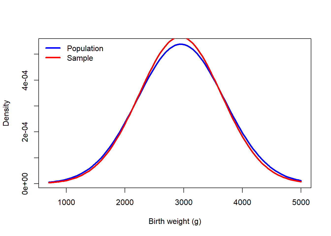
curve(pnorm(x, mu_true, sigma_true), 700, 5000, col = "blue", lwd = 3, ylab = "Cumulative probability", xlab = "Birth weight (g)")
curve(pnorm(x, m2, s2), add = TRUE, col = "red", lwd = 3)
legend("topleft", c("Population","Sample"), lwd = 3, col = c("blue","red"), bty = "n")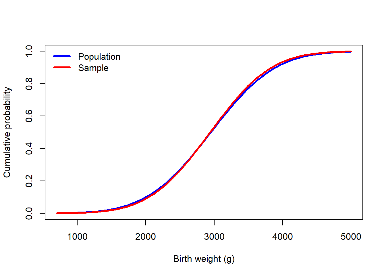
We can repeat this process many times so that we can see the amount of variation due to sampling.
one_sample <- function(n = 189, mu = mu_true, sigma = sigma_true ){
  d1 <- rnorm(n, mu, sigma)
  c(mean(d1), sd(d1))
}


set.seed(23405)
many_samples <- replicate(400, one_sample())

curve(pnorm(x, mu_true, sigma_true), 700, 5000, col = "blue", lwd = 3, ylab = "Cumulative probability", xlab = "Birth weight (g)")

for(i in 1:ncol(many_samples)){
  curve(pnorm(x, many_samples[1,i], many_samples[2,i]), add = TRUE, col = "#ff585810", lwd = 3)
}

curve(pnorm(x, mu_true, sigma_true), add = TRUE, col = "blue", lwd = 3)

legend("topleft", c("Population","400 samples"), lwd = 3, col = c("blue","#ff5858"), bty = "n")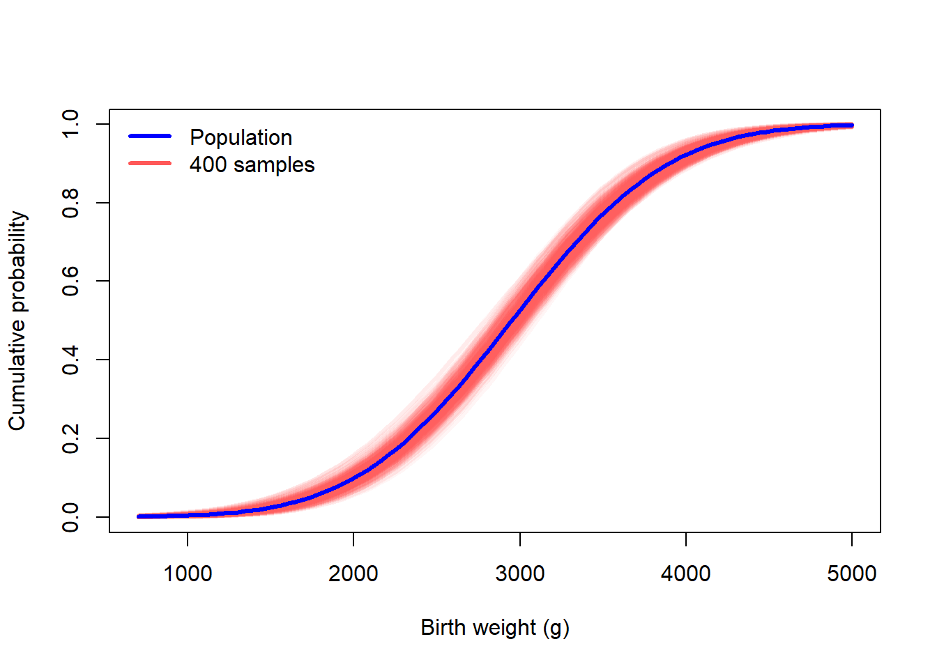
curve(dnorm(x, mu_true, sigma_true), 700, 5000, col = "blue", lwd = 3, ylab = "Density", xlab = "Birth weight (g)")

for(i in 1:ncol(many_samples)){
  curve(dnorm(x, many_samples[1,i], many_samples[2,i]), add = TRUE, col = "#ff585810", lwd = 3)
}

curve(dnorm(x, mu_true, sigma_true), add = TRUE, col = "blue", lwd = 3)

legend("topleft", c("Population","400 samples"), lwd = 3, col = c("blue","#ff5858"), bty = "n")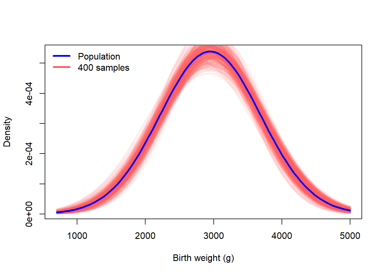
In addition to the CDF and PDF, one may plot the quantile function, also known as the inverse CDF. It is from this plot/function that we can find the median, quartiles, or any other quantile.
curve(qnorm(x, mu_true, sigma_true), 0, 1, col = "blue", lwd = 3, ylab = "Quantile", xlab = "Probability", ylim = c(1000,5000))

for(i in 1:ncol(many_samples)){
  curve(qnorm(x, many_samples[1,i], many_samples[2,i]), add = TRUE, col = "#ff585810", lwd = 3)
}

curve(qnorm(x, mu_true, sigma_true), add = TRUE, col = "blue", lwd = 3)

legend("topleft", c("Population","400 samples"), lwd = 3, col = c("blue","#ff5858"), bty = "n")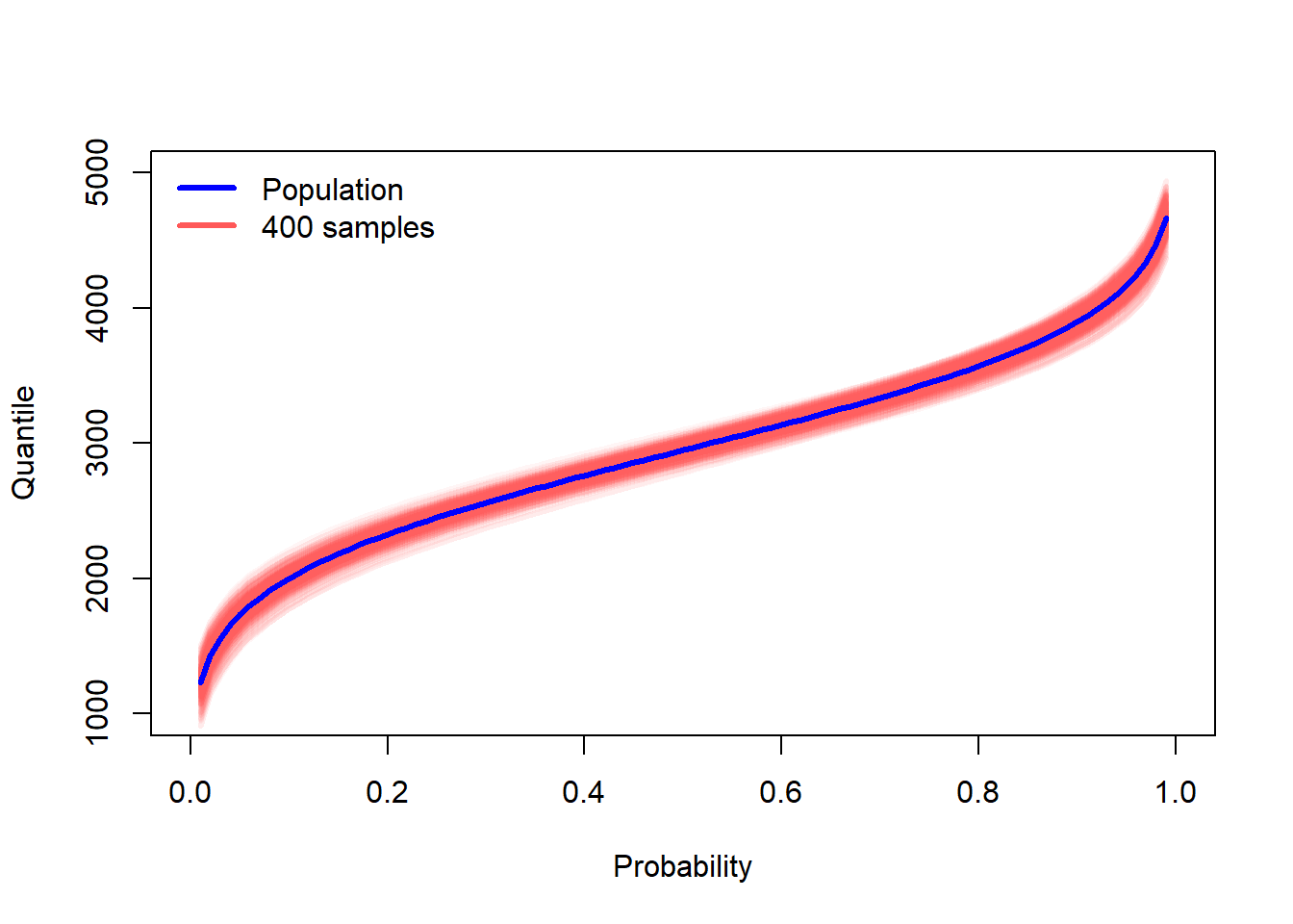
To isolate the sampling variation, we can center the draws by subtracting the true, population quantiles. A value of zero indicates the sample quantile matches the population quantile. Values above or below represent deviation from the population quantile. The black lines bound the middle 95% of sampling variation.
p <- ppoints(200)

out <- array(NA, c(ncol(many_samples), length(p)))
for(i in 1:ncol(many_samples)){
  out[i, ] <- qnorm(p,many_samples[1,i], many_samples[2,i]) - qnorm(p, mu_true, sigma_true)
}

spread <- apply(out,2,var)
ll <- -3*sqrt(max(spread))
plot(p, 2*sqrt(spread), ylim = c(ll,-ll), type = "l", ylab = "Sampling variation", xlab = "Cumulative probability")
apply(out,1,function(x){points(p,x,col="#ff585810")})NULLlines(p, -2*sqrt(spread))
rt <- seq(0.01,0.99,length=5)
rl <- qnorm(rt, mu_true, sigma_true) |> round(0)
axis(3, rt, rl )
title(main = "Birth weight (g)", font.main = 1, cex.main = 1, line = 2.5)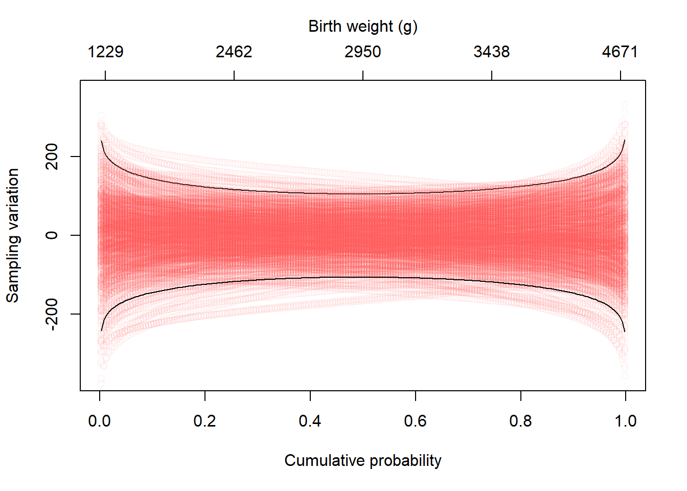
What is most striking about the deviations is that the spread is much greater in the tails. The median has the least sampling variation.
Any summary measure derived from the finite sample of data will have sampling variation. Here we show the sampling variation for the mean, standard deviation, and the probability of a low birth weight infant.
par(mfrow = c(2,2), cex.main = 1, font.main = 1)
hist(many_samples[1,], freq = FALSE, breaks = 25, main = "Sample mean", xlab = "")
box()
hist(many_samples[2,], freq = FALSE, breaks = 25, main = "Sample standard deviation", xlab = "")
box()
plot(t(many_samples), ylab = "Sample SD", xlab = "Sample mean", pch = 16, col = "#ababab40")
plbwt <- 0*many_samples[1,]
for(i in 1:ncol(many_samples)){
  plbwt[i] <- pnorm(2000,many_samples[1,i], many_samples[2,i])
}
hist(plbwt, freq = FALSE, breaks=25, main = "P(Low Birth Weight)", xlab = "")
box()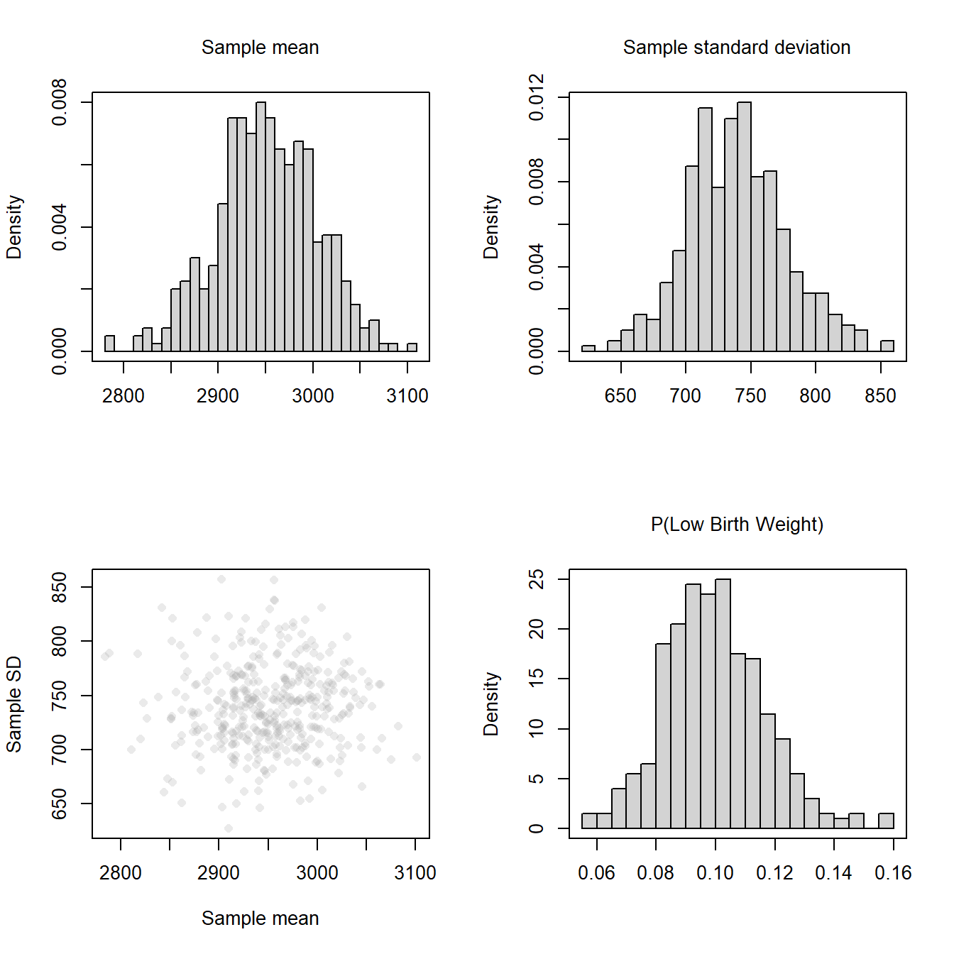
Note that in 400 replicates, the estimate of the probability of a low birth weight infant was as low as 0.056 or as high as 0.159.
One of the primary ways to communicate the uncertainty of estimates derived from a single sample is to report an interval. There are several types of intervals, including
The bootstrap is a resampling technique. Using the variation that results from resampling, one can get an approximate estimate of the sampling variation. In the figure below, we show the variability that arises from repeatedly creating a new sample from the true model (left) vs the variability that arises from repeatedly creating a new sample from the observed data (right). In left panel, the true model is blue and the red lines are the estimated (with MLE/MM) models from samples of size 189. In the right panel, the ECDF of the observed data (a single data set of size 189) is shown in blue. The red lines are ECDFs constructed from resamples of the original data.
par(mfrow = c(1,2), cex.main = 1, font.main = 1)

curve(pnorm(x, mu_true, sigma_true), 700, 5000, col = "blue", lwd = 3, ylab = "Cumulative probability", xlab = "Birth weight (g)")

for(i in 1:ncol(many_samples)){
  curve(pnorm(x, many_samples[1,i], many_samples[2,i]), add = TRUE, col = "#ff585810", lwd = 3)
}

curve(pnorm(x, mu_true, sigma_true), add = TRUE, col = "blue", lwd = 3)

title(main = "True model")

set.seed(23053823)
single_draw <- rnorm(length(bwt), mu_true, sigma_true)

plot(ecdf(single_draw), do.points = FALSE, xlab = "", ylab = 'Cumulative proportion', main = "Re-sampling (observed data)")
b1 <- array(NA, c(400,length(bwt)))
for(i in 1:nrow(b1)){
  b1[i,] <- sample(single_draw,length(single_draw), replace = TRUE)
  lines(ecdf(b1[i,]), col = "#ff585810", do.points = FALSE, lwd = 3)
}
lines(ecdf(single_draw), do.points = FALSE, col = "blue", lwd = 3)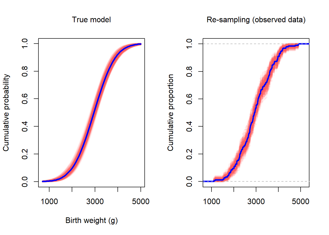
Individual resamples were created with the sample command. Suppose the data are in a vector y.
b1 <- sample(y, length(y), replace = TRUE)The vector b1 is a resample, with replacement, of the birth weight values, y. Notice that b1 is the same size as y. This is important because the degree of variation is determined, in part, by the sample size. Because the goal is to get a handle on the uncertainty, the resample needs to be the same size.
Notice that when we overlay several the ECDF of several resamples, the uncertainty band matches the uncertainty band in red in the left panel. Recall that the left figure was created from resampling from the known, true distribution. The figure on the right is based on resampling from the observered data.
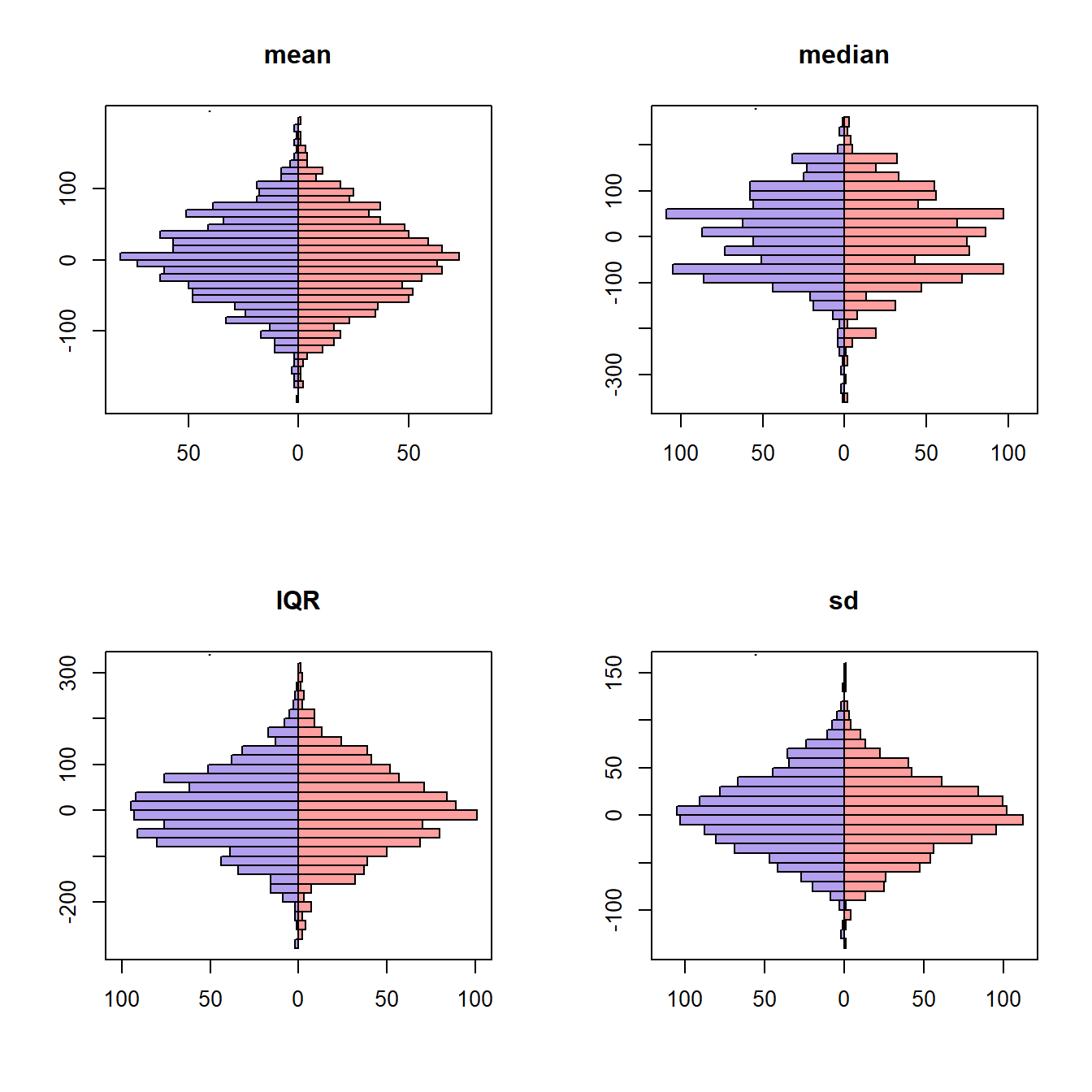
Let’s compare the sampling variation of the mean, median, IQR, and the standard deviation. The blue histograms were generated by creating 1000 new samples from the true population distribution and then calculating the summary quantity. The red histograms were generated by constructing 1000 new bootstrap samples by resampling from a single, observed sample. The summary quantity was calculated on each bootstrap sample. Because variation is of primary interest, the 1000 summary measures were centered at zero.
par(mfrow = c(2,2))
R <- 1000
n <- 150

out <- array(NA, c(4,2,R))
fn <- c("mean","median","IQR","sd")

set.seed(239852)
for(i in seq_along(fn)){
  f <- get(fn[i])
  for(j in 1:R){
    s1 <- rnorm(n, mu_true, sigma_true)
    if(j == 1){
      s2 <- s1
    }
    s3 <- sample(s2, length(s2), replace = TRUE)
    out[i,1,j] <- f(s1)
    out[i,2,j] <- f(s3)
  }
}

for(i in seq_along(fn)){
  rs <- out[i,1,] - mean(out[i,1,])
  bs <- out[i,2,] - mean(out[i,2,])
  tgsify::butterflyplot(c(rs, bs), rep(c(".",""),dim(out)[3]), breaks = 30)
  title(main = fn[i])
}
# plot(p, 2*sqrt(spread), ylim = c(2*ll,-2*ll), type = "l", ylab = "Sampling variation", xlab = "Cumulative probability")
# apply(out,1,function(x){points(p,x,col="#ff585810")})
# lines(p, -2*sqrt(spread))


# plot(p, 0*p, pch = "", ylim = c(2*ll,-2*ll), ylab = "Sampling variation", xlab = "Cumulative probability")
# uu <- unique(single_draw) |> sort()
# pp <- ecdf(single_draw)(uu)

# for(i in 1:nrow(b1)){
#   uuu <- unique(b1[i,]) |> sort()
#   ppp <- ecdf(b1[i,])(uuu)
#   ccc <- uu[cut(ppp, breaks = c(0,pp), labels = FALSE)]
#   lines(ppp, uuu - ccc, type = "s", col = "#ff585810", lwd = 3)
# }

# plot(pp, (uu) - pp)

# plot(, do.points = FALSE, xlab = "", ylab = 'Cumulative proportion', main = "Re-sampling (observed data)")
# b1 <- array(NA, c(400,length(bwt)))
# for(i in 1:nrow(b1)){
#   b1[i,] <- sample(single_draw,length(single_draw), replace = TRUE)
#   lines(ecdf(b1[i,]), col = "#ff585810", do.points = FALSE, lwd = 3)
# }

# rt <- seq(0.01,0.99,length=5)
# rl <- qnorm(rt, mu_true, sigma_true) |> round(0)
# axis(3, rt, rl  )
# title(main = "Birth weight (g)", font.main = 1, cex.main = 1, line = 2.5)
The symmetry in the plots suggests that the sampling variation can be captured with bootstrap resampling.
One way to create an interval from the bootstrap resamples is to use the middle X%, say 99% or 95% or 90%. The term middle can be defined in multiple ways; the quantile definition is based on eliminating equal mass in each tail. For example, with 1000 replicates, the quantile definition would eliminate the smallest 25 and largest 25 estimates in order to get a 95% bootstrap interval.
set.seed(2532)
B <- 1000 # Number of bootstrap replicates
plbwi <- rep(NA,B)
for(i in 1:B){
  b1 <- sample(bwt,length(bwt),replace=TRUE)
  plbwi[i] <- ecdf(b1)(2000)
}
par(mfrow = c(1,2), cex.main = 1, font.main = 1)
plot(ecdf(plbwi), main = "ECDF of Bootstrap P(Weight < 2000 g)", xlab = "")
hist(jitter(plbwi), freq = FALSE, breaks=50, main = "Histogram of Bootstrap P(Weight < 2000 g)", xlab = "")
abline(v=quantile(plbwi, c(0.025, 0.975)), col = "red")
box()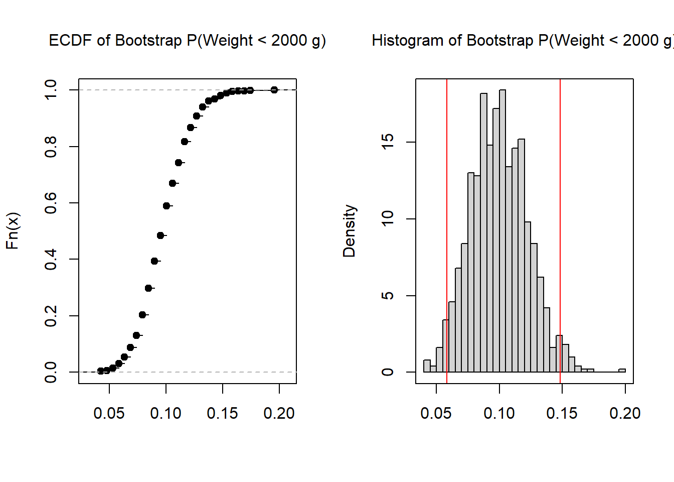
quantile(plbwi, c(0.025, 0.975)) 2.5% 97.5%
0.05820106 0.14814815 When communicating the results, the initial estimate is reported followed by the interval. For example, with the birth weight data, one might write: the probability of a low birth weight infant is 0.10 (95%: 0.06, 0.15).
In addition to confidence intervals, there are support intervals and credible intervals. Support intervals are based on the standardized likelihood and are often used in conjunction with maximum likelihood estimation.
The figure below shows the standardized likelihood for a binomial outcome. In a sample of 30 trials, there were 9 successes. The MLE estimate of the success probability, \(p\), is 9/30 = 0.3. The support interval is created by intersecting a horizontal line with the standardized likelihood. The two intersection points are the bounds of the interval. The size of the interval is determined by the height of the horizontal line. In the figure below, the height is set at 0.06. Typically, the height of the bar is expressed as \(\frac{1}{k}\). So, rather than calling it a 0.06 support interval, one would call it a \(\frac{1}{16.6}\) interval, as in one over sixteen point six interval. Commonly reported intervals include \(\frac{1}{8}\), \(\frac{1}{20}\), \(\frac{1}{32}\), \(\frac{1}{64}\). Because there is a link between a \(\frac{1}{20}\) support interval and a 95% confidence interval, the \(\frac{1}{20}\) is probably the most commonly reported.
Hands on: Drag the horizontal bar up and down to see how the interval changes. What is the \(\frac{1}{8}\) interval? What is the \(\frac{1}{20}\) interval?
Credible intervals are based on the posterior distribution and are used with Bayesian estimation. Recall that Bayesian estimation, the analyst incorporates a set of prior beliefs to the analysis. The posterior represents the prior beliefs updated by the observed data. The figure below is the posterior distribution for a binomial outcome with 9 successes in 30 trials. The highest posterior density credible interval is created by intersecting a horizontal line with the posterior. The two intersection points are the bounds of the interval. The size of the interval is determined by the proportion of the density between the bounds. A 95% credible interval contains 95% of the mass in the distribution. 95% and 99% credible intervals are commonly reported.
Hands on: Drag the horizontal bar up and down to see how the interval changes. What is the \(95%\) credible interval? What is the \(99%\) credible interval?
Each of the intervals discussed in this chapter have an important property. As the sample size gets larger, the intervals get smaller. This is appropriate because there is less uncertainty as the sample size gets larger. In this section, we uncover the exact relationship between sample size and sampling variation/error/interval size.
The code below shows how to calculate the absolute error for the estimate of the mean birth weight based on a sample of 100 infants. Because we know the true population model, we can calculate the absolute difference.
s1 <- rnorm(100, mu_true, sigma_true)
abs(mean(s1) - mu_true)
[1] 80.08154If we repeat the process many times, we can get a distribution of the absolute error.
abs_error <- replicate(1E5, abs(mean(rnorm(100, mu_true, sigma_true)) - mu_true))
hist(abs_error, xlab = "", main = "Absolute error", freq = FALSE)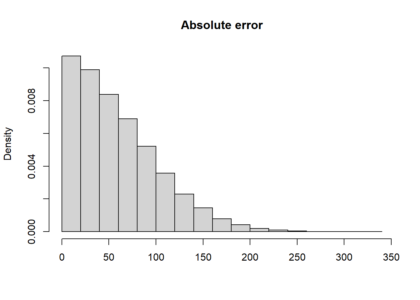
The mean absolute error is 59.1.